Making Narratives Physically Accessible
The BC Museums Association gratefully acknowledges funding support of this project from the Government of Canada.

Download the complete tool as a pdf
Introduction
Stories are what we do as humans. It’s how we process linear information. And museums – particularly history and heritage museums – convey their information by telling a story in a physical space. But what if the physical space isn’t accessible to all?
As a museum professional and guest who uses a wheelchair, I have visited dozens of exhibits but rarely get the full story as the designer intended. I have even worked in museums and been unaware of labels and objects out of my sight. This situation is embarrassing for both the museums and me. Many exhibits do not consider narrative when creating accessibility accommodations.
Museums should strive for universal design so all visitors can get the whole story, but older buildings, heritage sites, and budgetary constraints make this idea a fantasy, particularly for smaller museums. However, small improvements can make a world of difference for visitors who use mobility devices.
The Smithsonian Guidelines for Accessible Exhibition Design and other such documents provide guidelines for accessibility. However, these guidelines represent the “baseline” of accessibility in museum buildings. They do not consider the museum experience such as narrative experiences and spatial media (how visitors move around an exhibit. Some exhibits – such as heavily narrative-reliant exhibits – a prescribed path of viewing and moving is critical to understand the storyline). People with access concerns often have to plan ahead and ensure there are accessible washrooms and parking, but museums should strive to do more than this basic minimum requirement.
This document will outline three common issues in narrative exhibits that prevent full enjoyment for all and seeks to provide a range of solutions that fit specific exhibit needs and budgets.
But wait… why should we even care?
Ethically, museums have a responsibility to serve all members of their communities. However, there are also financial benefits in striving to be more accessible. With an aging population, museums in Canada are already seeing an increase in older visitors. Our demographics as a country are changing. Museums need to adapt to the changes of the 21st century or risk becoming obsolete from financial challenges,[1] something many museums are already facing during the COVID-19 global pandemic. According to studies, approximately 30% of the population will require access accommodations at some point in time, whether it be due to short or long term injury or illness, seniors or families with young children in strollers.[2] These align with target demographics for many museums.
This resource is not to overhaul all museum spaces to make all museum buildings in BC wheelchair, walker, and stroller friendly. That would be a monumental undertaking for any museum, and the BCMA has outlined plenty of resources on elements such as ramp slope and doorway width if that is something your museum wishes to look into basic building accessibility. Instead, this resource is to identify common errors in museum narratives to get exhibition designers, curators, and whatever role you may fill, thinking how a more diverse population can better enjoy their journey through your exhibit.
[1] Graham Black, Transforming Museums in the Twenty-first Century (Abingdon: Routledge, 2012), pp.1-3
[2] Simon Darcy and Tracey J. Dickson, “A Whole-of-Life Approach to Tourism: The Case for Accessible Tourism Experiences,” Journal of Hospitality and Tourism Management 16, no. 1 (2009): p.32-33, doi:10.1375/jhtm.16.1.32.
Issue 1: Navigation
If you have used a wheelchair or have had a child in a stroller, you’ve heard the praise, “the ramp is around back.” Museums and heritage sites often use alternative entrances (such as ramps and elevators) into the building and exhibits. Often when museums do this, there is no further thought as to where the path goes from the top of the ramp or when the elevator doors open. How does one get from the accessible entrance to the beginning of the exhibit where the narrative begins? Do guests have to backtrack through an entire exhibit to get to the beginning? If so, does this ruin the experience for them?
It might seem like a simple concept, but many museums do not indicate where an exhibit begins, let alone how to get to the beginning point from an alternative entrance.
And what if there are (gasp) stairs? What should museums do if there’s no possible way to make an area of an exhibit physically accessible to people with physical disabilities?
What navigation issues look like:
- Alternative entrances or routes (which in itself isn’t an issue, only when directions are unclear)
- Parts of the exhibition or experience that is inaccessible (for example, up a set of stairs)
- Unclear or confusing directions
Possible Solutions:
- Maps or other informational pamphlets
Front desks often provide visitors with maps of museums. Consider having an accessible guide that directs visitors to elevators and ramps and where visitors should go from there to get to the beginning of an exhibit. These maps can also tell guests where accessible washrooms are and places to sit if a guest experiences museum fatigue.
- Better training for front staff
Train front desk staff to direct guests who may need them to elevators or ramps and tell the guests where to go from there to reach the beginning of an exhibit. Careful not to overwhelm guests with directions. If the directions are complicated, consider a map.
- Arrows on floors
In the wake of the COVID-19 pandemic and social distancing orders, many museums have used floor decals to indicate an exhibit’s flow to prevent backtracking. I urge museums to keep such indications even after the pandemic. Indicating how a visitor should move through a narrative space is helpful for people who have to use alternative routes and all visitors to understand a narrative better.
- Guided tours
You can’t deny that human interactions are the most adaptable to any situation. Museums may not have the staff available to offer regular guided tours, but they can enrich the museum experience if available. Guided tours tell the story of the exhibition in the way the narrative requires; guides can adapt to guests’ individual needs. If an elderly visitor is struggling to keep up, the staff member can go slower. If there is a guest in a wheelchair, the guide can make sure they take the guest or group from beginning to end of the exhibit, so there is no confusion regarding navigation.
But what if there are stairs?
Parts of exhibitions that are up (or down) a set of stairs and no alternative routes are a particular issue for heritage sites. However, experiences that include a separate level can still be presented to guests with mobility needs; it just takes a bit of creative thinking. For example, take a heritage house where half of the narrative exhibit is up a flight of stairs, and there is no elevator. A person in a wheelchair might not be able to go up the stairs physically, but the narrative should still be offered to them to complete the story.
Exhibit designers may offer:
- A binder or pamphlet with pictures
A representation of the of the upstairs, pictures of notable objects, even layout drawings can be interesting to visitors unable to see the physical space, accompanied by interpretive panels that complete the story.
- Video of the experience
Record a guide (or curator if guided tours are not the norm) completing the narrative as they walk through the inaccessible space. Have this video available on a monitor (preferable) or by QR code.
- Miniature 3D model of the space
This should also include interpretive panels that complete the narrative.
These three options vary widely in price and can be combined. There are other solutions to the “stair issue.” Be creative, but complete the story or experience.
Issue 2: Interpretive and Object Labels
Ever read a book only to find a page ripped out? Likely not, but you probably have tried to preview a book on Google for research purposes, only to have pages missing from the preview. It’s annoying and frustrating.
Being unable to see a label or two might not seem like an inconvenience to some, and casual visitors might not say anything. But people who use wheelchairs or otherwise have a height disadvantage are allowed to be curious too. Our shortest patrons – children – are our most curious visitors. Everyone should be able to see and read all interpretative and object labels to get the whole narrative experience. Issues with labels are often the hardest to spot (unless you have the eye-line of an average wheelchair user). Still, they can often be the most straightforward accessibility issue to improve.
What label issues look like:
- Labels located too high or too low
- Barriers blocking the view of objects or labels (this is typically an issue when an object or is placed low or on the floor behind a barrier)
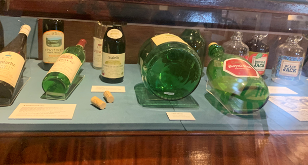
- Labels that lie flat
- Unclear font or graphics
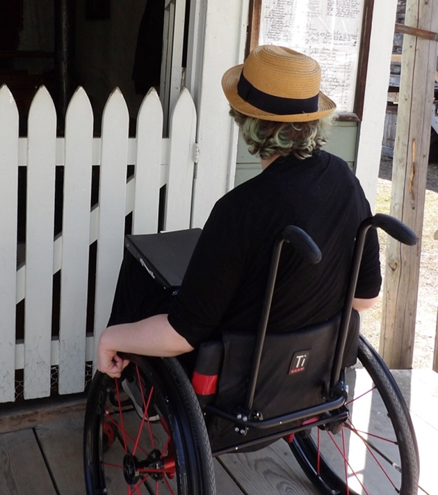
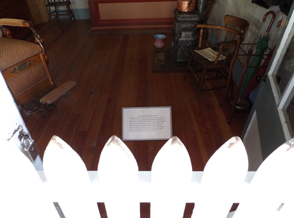
Image 1 (upper-left) and Image 2 (upper-right): barriers can affect what is seen. I (in the wheelchair) was unable to see this interprative panel placed too close to the barrier.
Image 3 (lower-right): Labels placed flat can often only be read from above.
Possible Solutions:
- Ensure all labels located on the walls are around the height of one meter
For detailed measurements and different scenarios such as objects in cases with a top-down view, see “Smithsonian Guidelines for Accessible Design” or other similar documents
- Ensure objects placed behind barriers are not too close to the barrier itself or consider transparent barriers if space is a factor
Remember, visitors at a lower height have a smaller angle of view than visitors of average adult height.
- Ensure no labels lie flat
Even if able-bodied visitors can look down on labels, the same might not be accurate for visitors with disabilities. Labels that are less than than 45 degrees (with 0 degrees as laying flat) might not be seen by shorter guests or guests in wheelchairs. Labels at higher angles or that lie flat may have glare from lights or glass that may make them difficult to read. This can also apply to some objects that might lie flat such as books or paper documents.
- Ensure all labels are printed in easy to read font on a plain background
Creative graphic design choices may work for able-bodied guests that can get closer to read but can lead to frustration for guests with mobility concerns. Labels etched into metal may look pretty, but they can be difficult to read from lower angles. Remember, different heights of visitors experience glare differently.
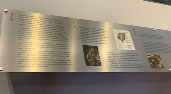
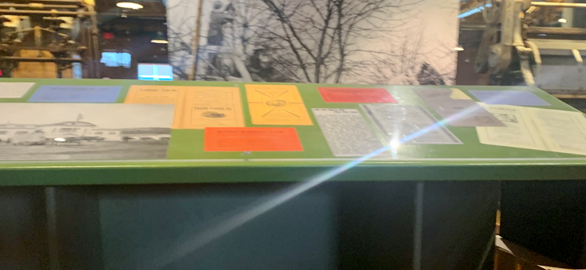
Image 4 and Image 5: Glare and angles can affect what is able to be seen and read at certain heights.
This issue is an important reminder to consider having all labels printed in large print – and braille if possible – in a binder so visitors with visual impairments can also follow along with narratives of objects. Have this binder available at the beginning of an exhibit.
Issue 3: Interactive Elements
Interactive elements are often not critical to a base narrative but are often a fun element of narrative experiences, so some consideration should be put into making them accessible to all guests. With a wide range of interactive museum elements and a wide range of guests’ abilities, these suggestions might not apply to every scenario. But use these lists as a guideline as two that may be problematic in your narrative exhibits and what you may be able to fix these issues or other similar problems.
What interactive issues look like:
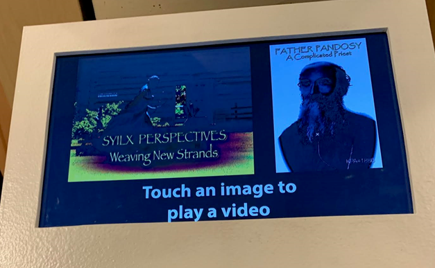
- Glare affecting certain viewing heights
- Height of screens and buttons
- Foot petals
- Drawers
Possible Solutions:
- Mount interactive screens vertically or close to vertical; or allow visitors to change the viewing angle
If screens are mounted at a low angle or horizontally, this creates similar issues as labels mounted at low angles. Visitors at a height disadvantage have to contend with glare and difficulty viewing – and interacting with – the positioned poorly screens.
- Ensure interactive screens (and other interactives) are at an accessible height
Refer to “Smithsonian Guidelines for Accessible Design” for exact measurements for individual interactives. But as an easy to remember and visualize guide, think of a bank ATM. ATMs are an example of universal design. They work for almost all users: screens, buttons, and slots are all comfortable for an upright adult to interact with but remain accessible for wheelchair users to use.
- Avoid foot-controlled mechanisms were possible
Foot-petal mechanisms are usually only seen in much older exhibitions and are often not swapped out due to cost, but museums should try to replace or rework any interactives that are not accessible to most visitors.
- Ensure all drawers are easy to open with large horizontal handles
Horizontal drawer pulls (also known as bar pulls) are more comfortable for individuals with limited dexterity (think arthritis) to open.
Interactive elements are where exhibit designers can get creative but ensure there are no accessibility issues if designers have opted to think out of the box. If there are accessibility concerns, you can also think creatively to come up with solutions. Some will fail, and that’s okay. Think about the needs of diverse guests, talk to other staff members and volunteers, consult guidelines such as the “Smithsonian Guidelines for Accessible Design,” and hopefully, you and your team will learn along the way.
Final Thoughts
Humans derive meaning from stories. We think in stories. Museums revolve around the stories we tell. But in many existing narrative exhibits, accessibility accommodations create confusion or are entirely non-existent. Guests with disabilities, senior members of communities, and families with young children all use accessibility accommodations. This is a considerable section of museum audiences. When designing exhibits, accommodations cannot be an afterthought. Most current exhibits do not have to be completely reworked to create a universal design that will give all visitors similar experiences. Think about how physically diverse individuals will experience an exhibit and make accommodations to bring that experience more in line with the narrative originally intended. If British Columbian museums seek to be inclusive to all, this should mean the entire experience, not just getting in the door.
About the Author
Raised in Northern BC, Briann Audet has always loved history and exploration. A graduate of University of Leicester’s School of Museum Studies, Briann now calls the Okanagan her home. She has a passion for accessibility advocacy, inclusion, and equality.
A special thanks Barkerville Historic Site, Okanagan Heritage Museum, and the Okanagan Wine and Orchard Museum for allowing the photographs in this resource to be taken.
